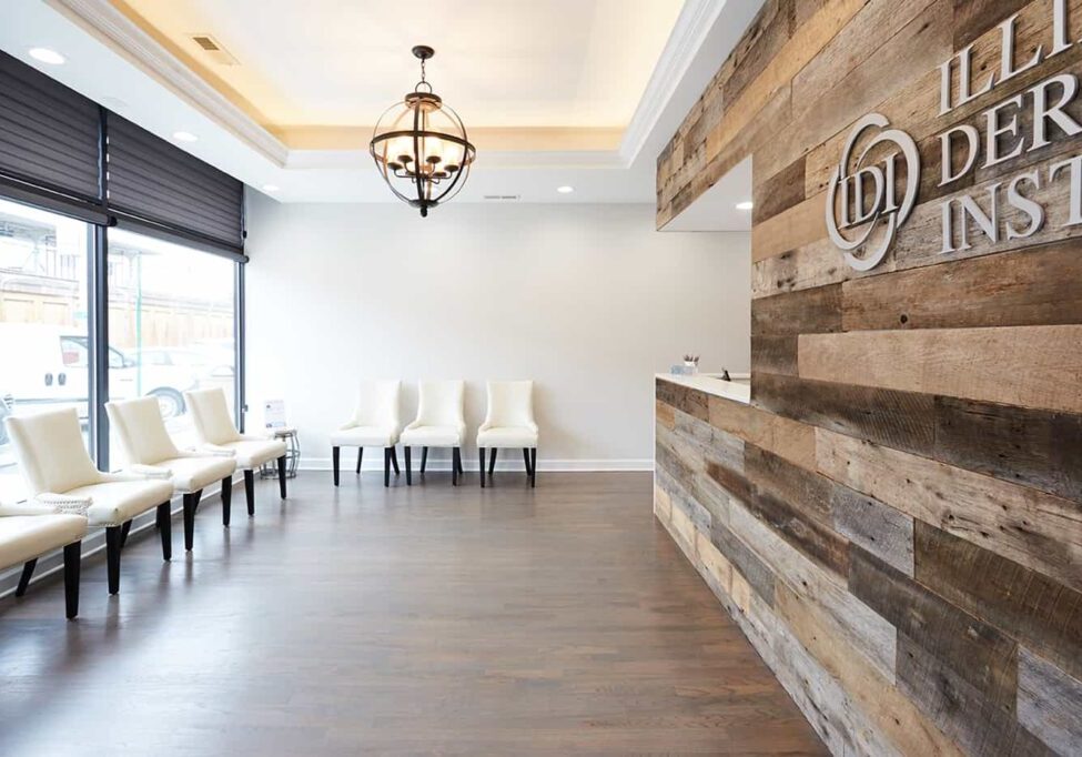
We’ve all heard the saying “you never get a second chance to make a great first impression.” But too often, we squander opportunities to maximize the first moment that a new or prospective patient comes to a dental clinic.
We spend so much time in our offices it’s hard to look at them with the eyes of a newcomer. But don’t let that familiarity stop you from giving your space a fresh look.
Dental marketing consultants have found that the appearance of your office is one of the biggest contributors to practice performance and profitability. Patients use it to assess your expertise and service in the absence of having the training to evaluate your clinical skills.
So if you are redesigning your dental office or considering a new space, one of the most helpful things you can do is try to experience your current clinic as a patient would. Approach the front door and consider what the signage and exterior communicate. Sit in the chairs in the waiting room, navigate your way through the reception process and appraise the aesthetics and flow of the operatories.
Based on that experience, draw up a wish list for what you hope to accomplish with your design, whether it’s for a new or existing space, and how it can be achieved. This is where the expertise of a good design-build firm can be helpful as they offer both design talent and knowledge about the feasibility of executing a design plan.
Here are some important things to pay attention to in your design:
- Using glass doors or doors with glass inserts both at the entrance and throughout the office conveys a sense of openness and alleviate subconscious anxiety among new patients as they move from waiting room to clinical areas.
- Make sure the waiting room layout is not cramped and offers adequate seating. Some experts recommend 1.5 chairs per operatory.
- The reception and appointment desks communicate a lot about your practice. They should have ample space, countertops about 44 inches high so patients can comfortably write and sign checks and their materials must convey quality.
- Lighting makes a huge difference in creating a calming, inviting atmosphere. Harsh lights remind patients of hospitals and institutions. Task lighting can ensure good work light.
- Bathrooms must be updated, including pleasing art and materials, and spotlessly clean. Position the entrance within view of the front desk staff so they can periodically check the restroom to make sure it is clean.
- Your consultation room should be of ample size, at least 9 feet by 9 feet and with an 8 foot ceiling, so that it creates a commanding impression. Patients will look to the furnishings, technology and aesthetics to assess the care you are proposing. Some designers contend that you can nearly double the average case acceptance rate to 80% with well thought-out design for this room.
