There is one fashion staple that stands alone as a truly timeless classic. It’s as in-vogue now as it was when debuted in the 1920s: The Little Black Dress. Designed by Coco Chanel and Jean Patou to be versatile and long-lasting, affordable, and accessible to the widest possible market, the LBD has stood the test of time and become an icon.
Hey, versatile, long-lasting, affordable and accessible sounds like a great recipe for a dental office, doesn’t it? We think so!
Here’s how we approach designing a classically elegant dental office that will still look good in a decade or more.
Clean Lines
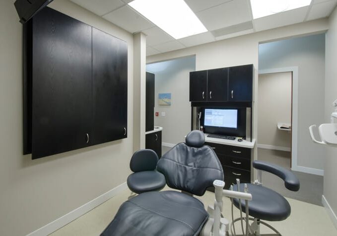
The complete remodel of an existing 3,000 square foot dermatology center into a five-operatory cosmetic dental practice allowed us to stretch our creative wings to modernize the space. For Dr. Sergio Rubinstein, we focused on clean lines in chairs, cabinetry, accessories, seating, and even the font of his logo which is front and center in the waiting area. However, clean lines – while always fresh and modern – can be perceived as cold and clinical if not balanced. To warm things up, we chose wood cabinetry for the front desk, taupe textured wallpaper, and large colorful images of stunning nature scenes of forests, beaches, and rushing rivers.
Pairing Neutrals with Colorful Accessories
Our Smiles Downers Grove project is a perfect use case for pairing neutrals with colorful accessories. This family dental practice has to appeal to all age groups, from young children to their grandparents, while remaining warm, friendly, and professional. In the waiting area, oatmeal-colored chairs with modern, clean lines, match the warm light taupe walls with classic white trim, which are set off by the contrast of dark wood floors and natural light. The pops of color are only found in portable objects, like purple kid-sized bean bag chairs and bright green plants. As seasons change, and tastes change, these accents can be traded out for colors that are trending, keeping the entire office fresh.
Great Lighting is Always in Vogue
Nothing dates a space faster than fluorescent lighting (especially when combined with dropped ceilings!). Redesigning the lighting in your dental office can have a significant and lasting impact on its appearance. We try to maximize available natural light and raise ceiling height by removing dropped ceilings and installing recessed lighting – when possible. The goal is to create an open, airy space that energizes employees and patients – both of which can be achieved by light.
Room to Grow
No matter how classic your interior design is, your dental office won’t last a decade unless the space planning has incorporated room to grow as your needs change. Even if you’re a one-dentist operation from start to finish, there are sure to be technological advances your office will want to adopt in the future which will have different space requirements. In our initial consultations, we ask you about your plans for the future precisely so we can incorporate that future potential into your design. Where do you want to be in ten years?
Fashions may change, but style is forever. When you’re ready to add some long-lasting style to your dental office, give us a call.
