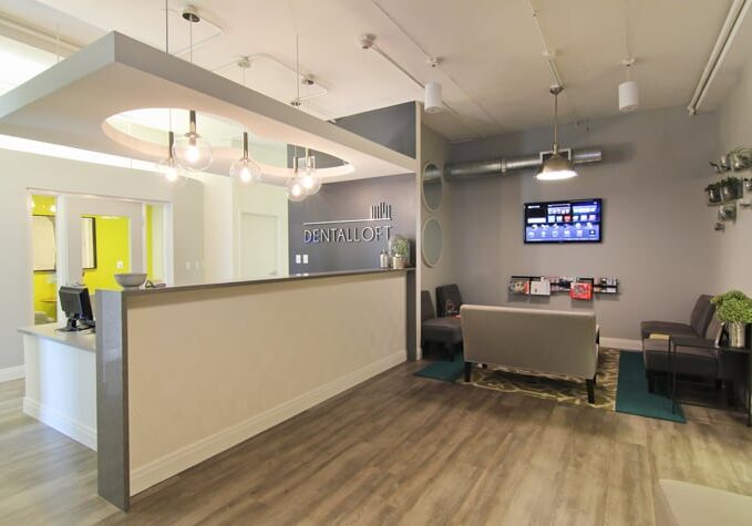
Since 2006, Wells Fargo has sponsored an annual, nation-wide Dental Office Design competition. The result: Eight years’ worth of beautiful, functional designs that highlight what works best. We encourage you to take a look and get ideas! To determine the winners, The Dental Office Design Competition panel of judges uses five criteria – which you can also use to brainstorm your own dental office build-out or renovation.
Winning Design Principle 1: Your Design Has to Work For You
The first principle a winning design must include is that of functionality. The design must solve an initial problem, whether that is to increase space for patients, make room for new technology, or create a friendly, welcoming environment. This is also a great question with which to begin your own dental office design process: What problems do you need your design to solve?
Winning Design Principle 2: Form & Function Within Budget
If everyone had an unlimited budget, creating an award-winning space would be easy! Expensive, but easy. The challenge comes when you have a limited budget, need to solve a problem, and need the end result to be aesthetically pleasing. The competition judges look at how architectural design, clinical function, technology integration and ergonomic design come together within a finite dollar amount. In order of importance, form should follow function.
Winning Design Principle 3: Floor Plan Efficiency
Balancing room to move now, and to possibly expand later, with efficient traffic flow between work zones is more challenging than you’d think. A great floor plan not only has to work for you and your patients now, but give you a chance to expand or add new technology in the future. When you look at a prospective floor plan for your office, ask yourself if it gives you sufficient room to grow – or, if it’s too much space! The flip-side of having too little room is having too much. Balance is key.
Winning Design Principle 4: Keep Current
In the dental industry, to stay competitive, you have to stay current with updated equipment. These changes will affect your design, like when you ditched the darkroom for digital x-rays.
Winning Design Principle 5: Aesthetic Appeal
Finally we get to how the dental office looks! Yes, this is the very last principle on the judges’ list because they know that, at the end of the day, a good design is a solution first and foremost. But looks do matter. Your office is the physical representation of your brand and your personality, and it also has to appeal to your target clients! All of this means that it has to look sleek and professional to instill confidence while meeting clients’ needs. It’s your first impression, and you know what they say about those (they’re the most important!).
For more inspiration, check out the 2014 Dental Office Design Competition winners here. Then create your wishlist and give us a call.
