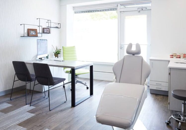
Tired of looking at the peeling blue floral wallpaper that dates your dental office design back to 1995? Your patients are too! Don’t let your dental office depress your clientele before they even sit in the chair. The right design can transform your office into a bright, fun, and cheerful space that will keep your clients (and your staff) smiling!
A dental office design as unique as your practice
1. Choose feel first
Before speaking with a designer, ask yourself this: How do you want your patients to feel? Relaxed? At home? Cheerful? The right design can achieve that and more. For example, a homey atmosphere can put patients at ease. Modern styles, however, can reflect your cutting-edge methods and inspire confidence in your expertise, whereas a spa-like atmosphere might be exactly what your cosmetic dentistry office needs to attract high-end clientele.
2. Use color
Numerous studies have shown that color has a real effect on emotion. So, when choosing a palette, we start with emotion first. Color therapists say blue and green are the easiest colors to focus on for long periods of time and may soothe nerves and help relieve discomfort. However, blues and greens aren’t the only colors that create a relaxing atmosphere. You might choose warm browns with natural woods and stone for a dental office reminiscent of a cozy lodge; or, you could take the local coffee shop as inspiration for a modern, yet comfortingly familiar look. Check out our Chicago dental office design project gallery for examples!
3. Go natural
Whenever possible, our designs use lots of natural light. One of our favorite projects featured several dentists’ chairs positioned so clients had a view of the park-like setting outside (and dentists, hygienists, and assistants had ideal lighting for their work). Natural light is energizing, which is important when you and your staff are on your feet all day. However, if natural light is not an option in your office, we can recommend several lighting solutions that will have similar effects.
4. Add a touch of whimsy
If you have a pediatric dentist office, you’ll definitely want a design that keeps the kids entertained (and in some cases, contained). But adding a touch of whimsy works even for adults-only practices. In one of our designs, inspired by a country cabin, we added decals of branches and flocks of flying birds around the sink area. Both kids and their parents loved the creative touch.
5. While you wait
Your waiting area is where patients settle their nerves, try to relax with the latest issue of Home & Garden, and keep their children busy with books and crayons. But did you know that there’s a science to designing the layout of waiting areas? Chair positioning is very important to patient comfort: You don’t want chairs facing each other, but you do want them facing the direction from which patient names will be called. People tend to like chairs with armrests better than sofas, but adding a bench into the mix is good both for plus-sized patients and families.
6. Make it personal with art – or articles
Going to the dentist can be scary – but less so if you know your dentist, or hygienist, more personally. Give your office some personal touches that reflect you, your staff, and your community. You might consider framing photos of you, and/or your staff, engaged in your favorite hobbies, or offer a community bulletin board for playbills and puppy ads. Some dentists even like to post their favorite dental cartoons on the wall.
How would you like your patients to feel when they walk in your door? Answer that, then ask us how we can help.
