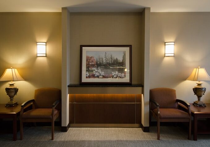
The waiting room – as the name implies, it’s where your patients spend much of their time. It’s also their first impression of your practice. How your waiting room looks, and more importantly, feels can help you win the trust of your patients and help make their experiences with you positive.
Medical facilities haven’t traditionally valued the importance of the waiting area, but that is quickly changing. The goal many of our providers approach us with is to make their patients and visitors feel comfortable and appreciated for their time. It’s a more customer-service oriented approach to medical office design.
So why are so many medical offices doing it wrong?
Often, it’s not a designer making the decisions, but rather the office furniture supplier. They may, or may not have a background in interior design. Most likely, they just know how to sell furniture! We recommend bringing in a professional who is knowledgeable about medical office design as it relates to patient experience. When you have pros on your team, they’ll likely suggest something like this:
Elements of a Successful Waiting Room Design
Hint: It’s all about user experience
Make Waiting a Little Easier
Waiting is hard, whether you’re waiting for yourself or for a loved-one. The best waiting rooms help not-so-patient patients pass the time in ways they find valuable. For example, if your patients are busy professionals, setting up Wi-fi and workstations would be much appreciated. If parents and children are also part of the mix, you may want to designate a play area with paper and crayons (preferably away from the workstations). Studies have shown that most people want to read, work, and use their cell phones in waiting rooms, so if you have to choose between cable TV and Wi-fi, get the Wi-fi!
Divide and Conquer
Gone are the days of rows of uncomfortable chairs. The new waiting rooms are separated into sections, stations and nooks so that each patient and visitor has a choice in how they’d like to wait. Think of a coffee shop. Usually you’ll find a couple of cozy chairs with a small table in one corner, a long table with power outlets for thirsty workers, and four-seat tables for families. Use dividers to separate the quiet work areas from play areas and/or TV zones.
Let them See a Little Further
It can be frustrating to wait and wonder what’s going on. What could everyone possibly be doing behind those doors? Some medical office designs use glass doors to separate the waiting area from the back of the house so patients can see you and your employees coming and going. Seeing some bustle ensures your patients that you’ll get to them – eventually. Bonus: Your exiting patients will have an easier time finding the exit!
Technology is Good, But Don’t Lose the Human Touch
Check-in Kiosks are becoming more popular, but from the experience of the patient, talking to a human being upon entering a medical office is still important. Spas have this system down – they tend to have small reception areas to register clients as soon as they come in the door, and then have comfortable, relaxing areas for them to wait with soft music and magazines.
Does your waiting room need a face-lift? Call us for a consultation!
